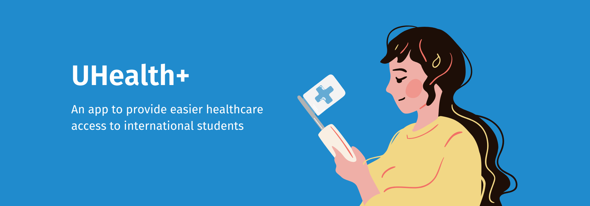
University Healthcare Mobile Application
Project Details
- Conducted Secondary Research
- Designed and conducted Interviews and Usability Tests
- Created Persona and User Journey
- Designed the Lo-Fi, Mid-Fi and Hi-Fi prototypes
Overview
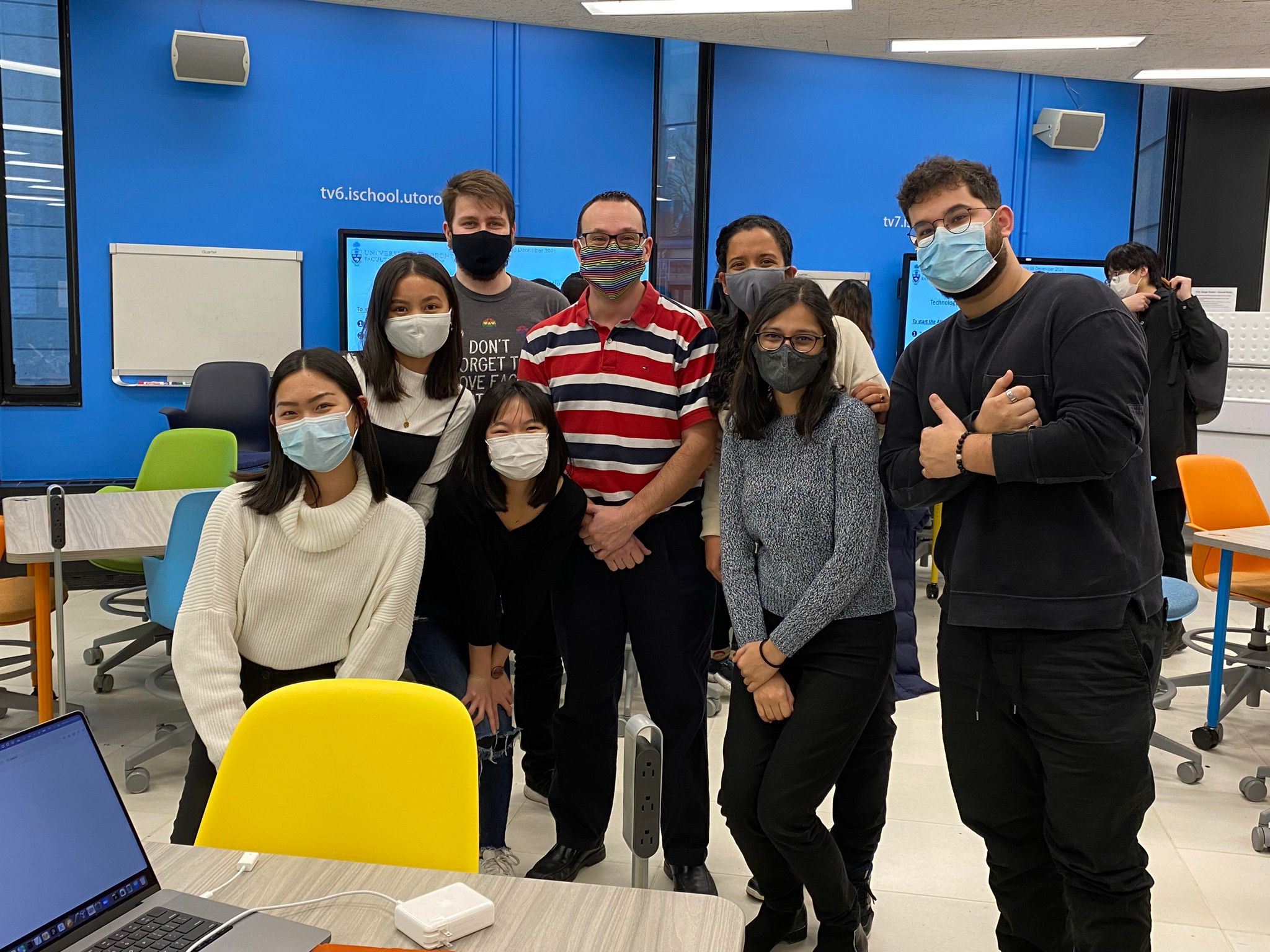
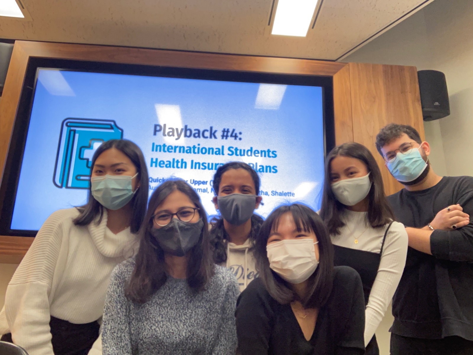
It all began when a team of six international students asked, "What matters to UofT students?"
The answer came from our personal experiences – Understanding healthcare insurance plans and accessing healthcare services. So, we collaborated with UofT’s Innovation Hub to create an application that made access to healthcare easier for international students.
Research
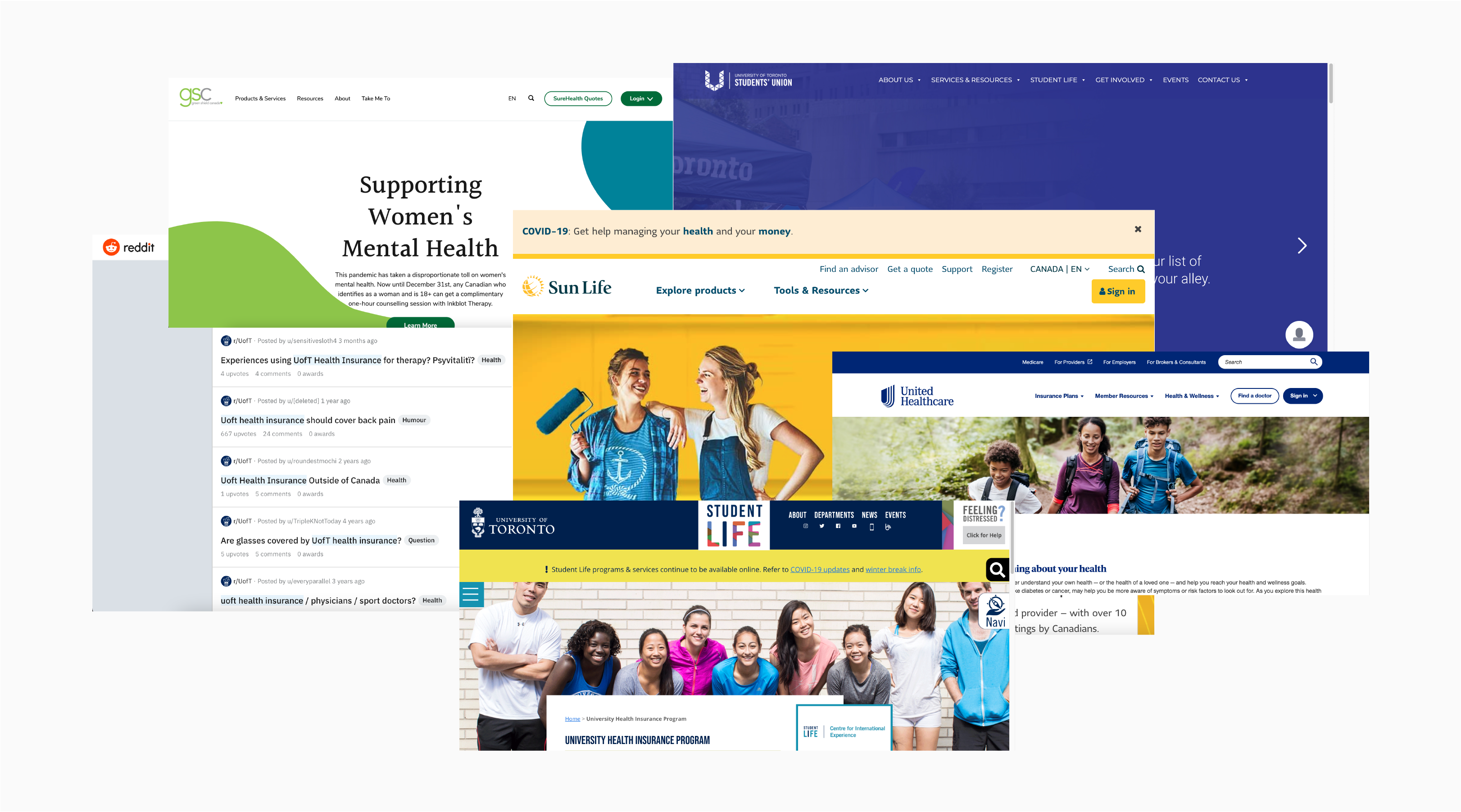
Our secondary research revealed that international students have two types of plans that offer different services – UHIP (University Health Insurance Plan) and Supplementary Plans. Details regarding healthcare insurance plans and services were scattered across multiple websites, making it hard to find relevant information when needed.
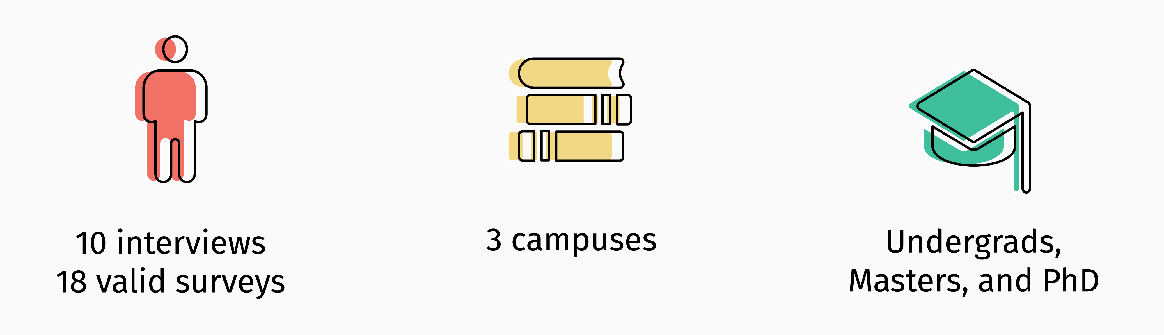
We then conducted primary research in the form of interviews and surveys. We recruited international students of varying education levels from all three campuses (St George, Scarborough and Mississauga) to understand their issues with healthcare.
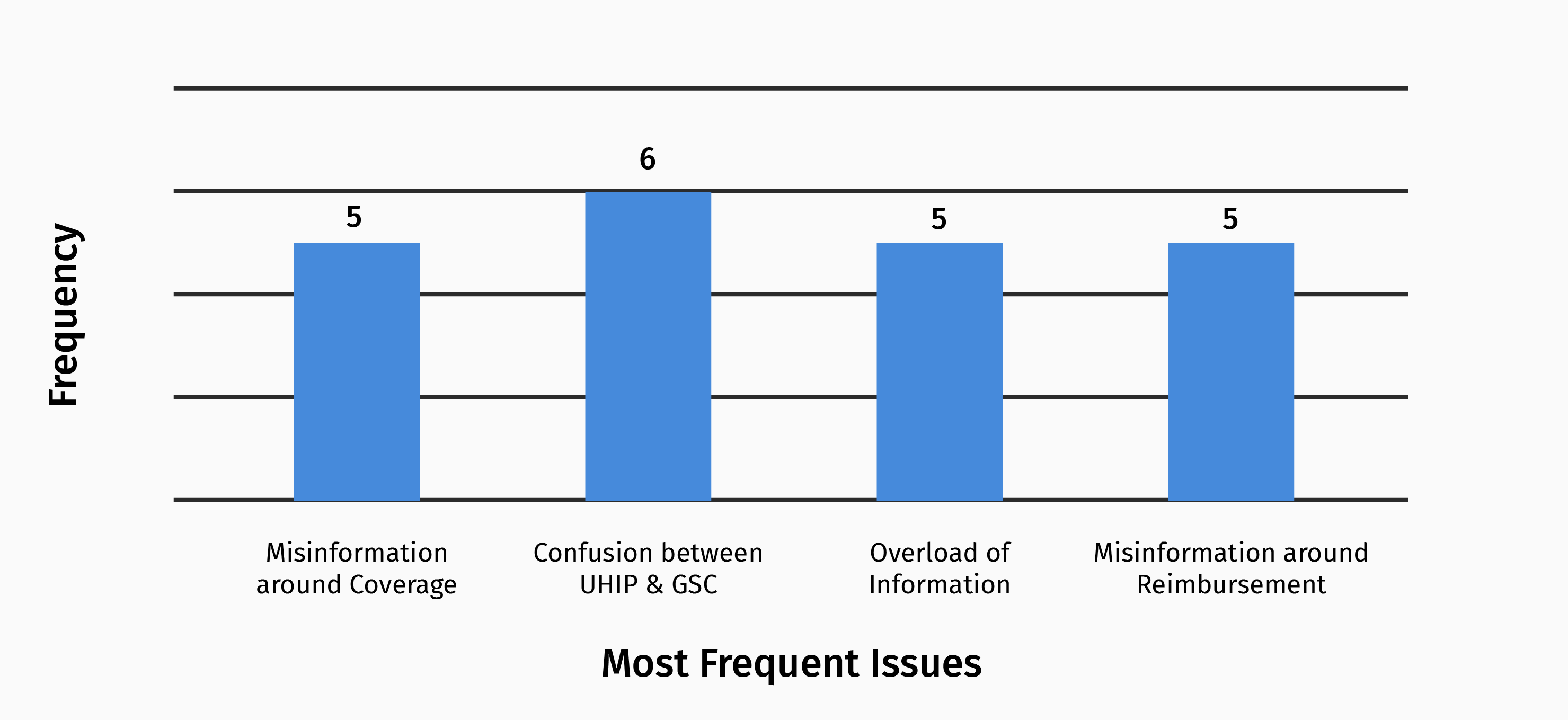
The results revealed that participants frequently deal with confusion, misinformation and information overload around the various aspects of healthcare.
“I didn’t know I was paying so much money for healthcare coverage I didn’t even know I had.”
“Why was I lied to?”
“This was different from what they said earlier.”
– Interview Participants
The Problem
These findings validated our experiences and clarified the problem space. The current state of accessing information regarding international students health insurance plans places the burden of finding accurate healthcare information on international students with little-to-no guidance.
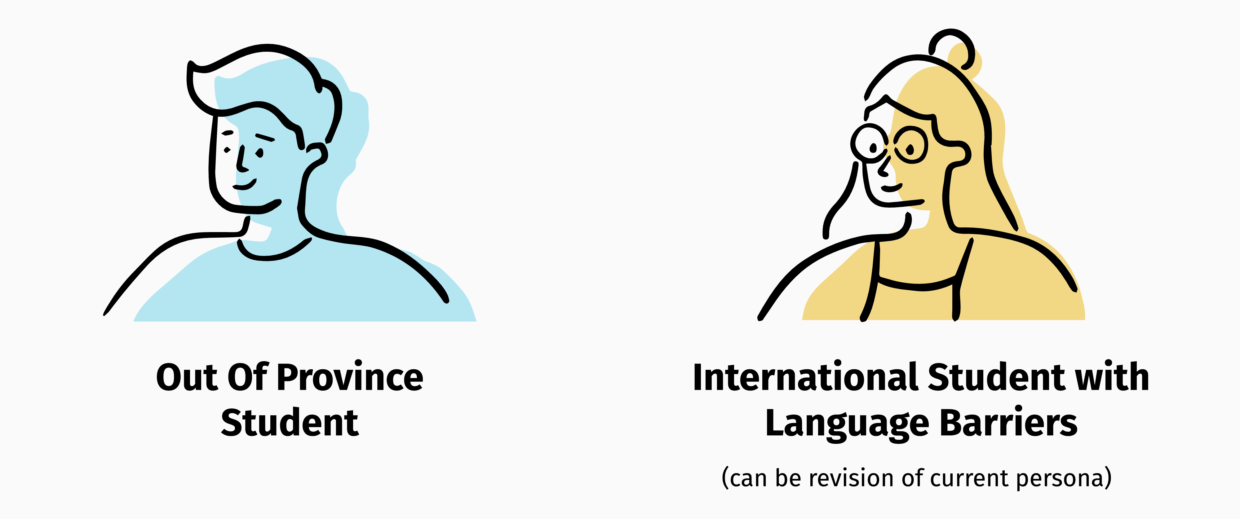
Persona
Our research helped us discover Issa Inamorato, the International Student.
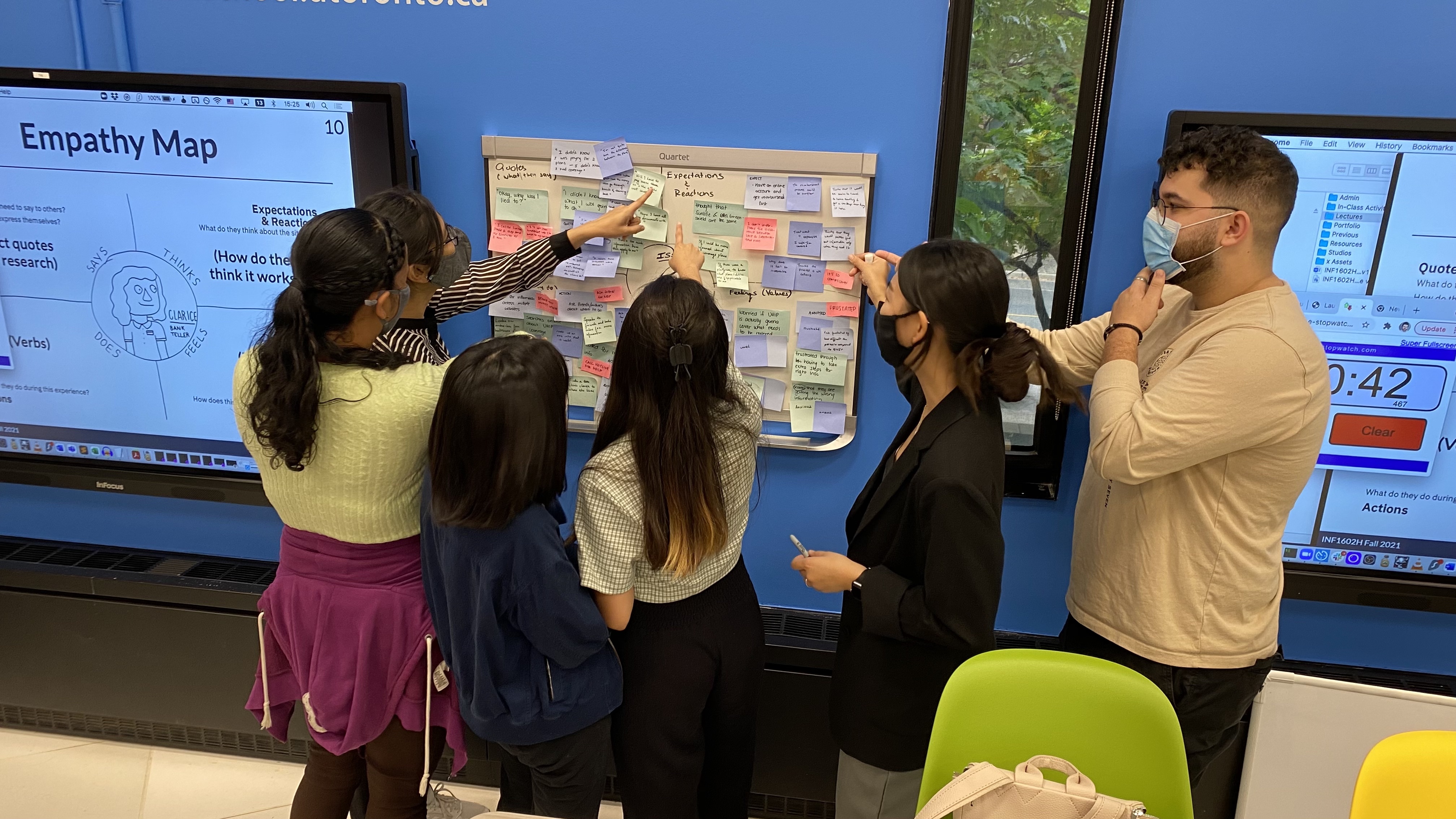
We began to learn about her actions, thoughts and feelings.
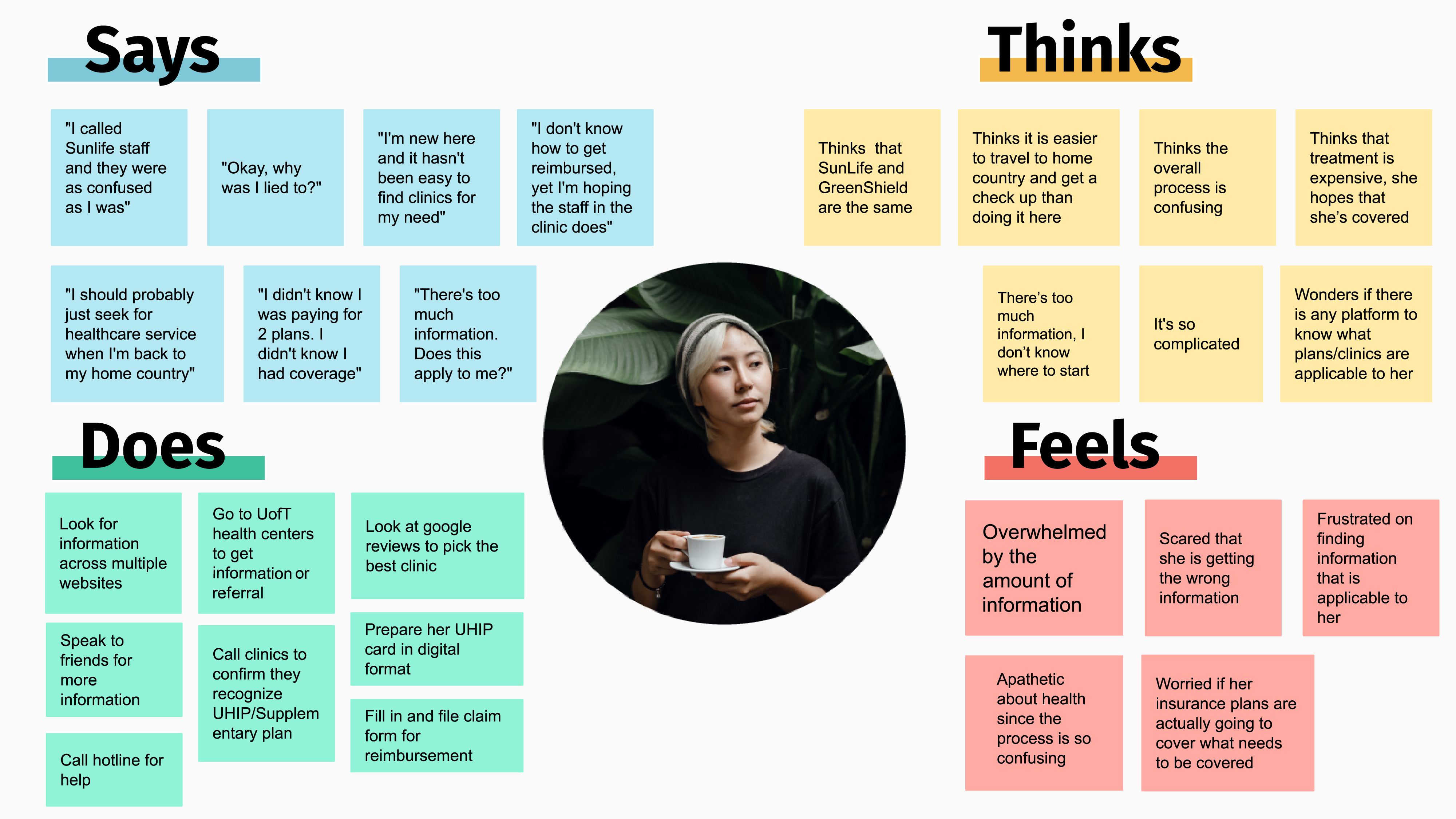
Soon after, we started to understand her goals, fears and needs.
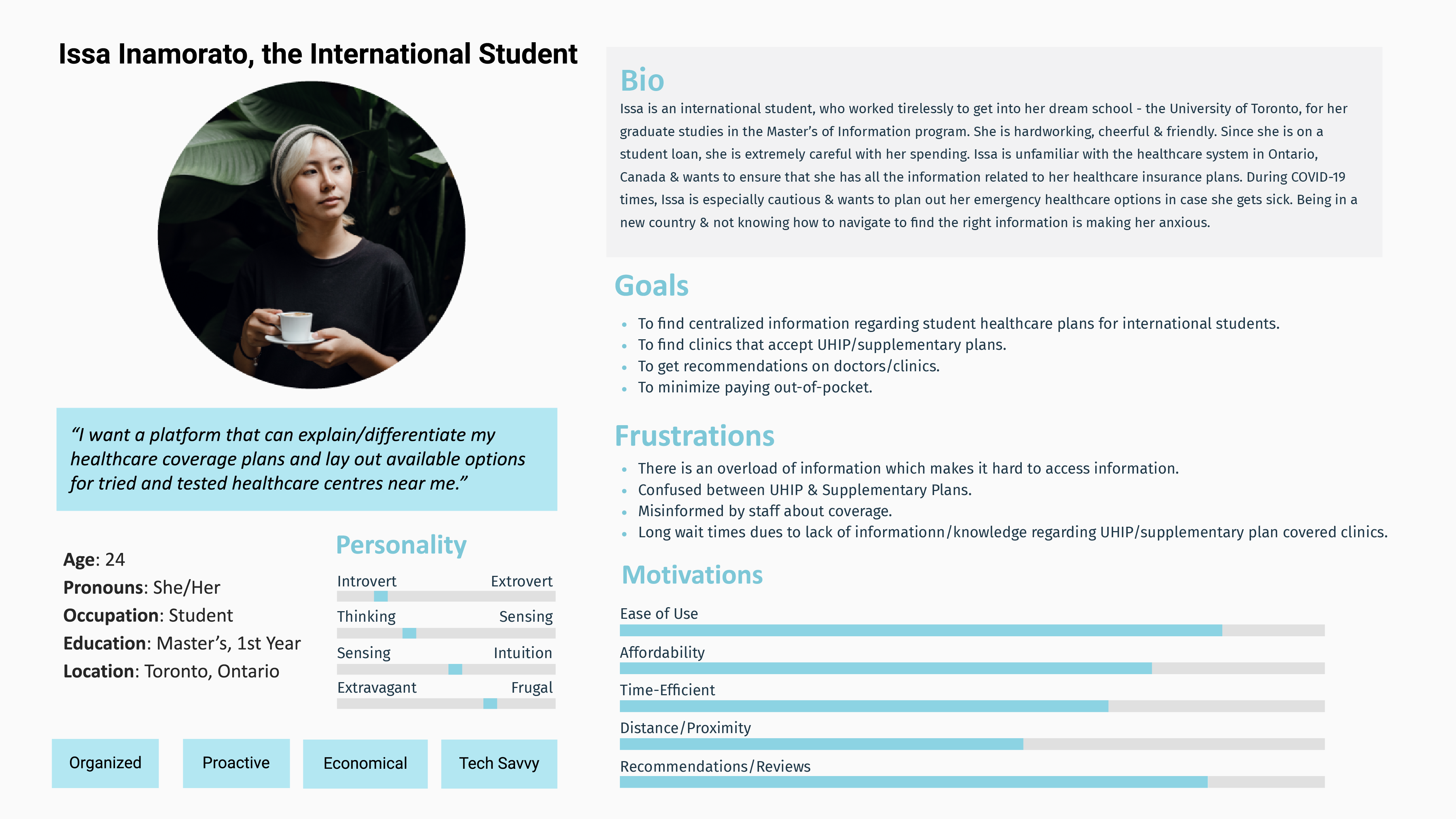
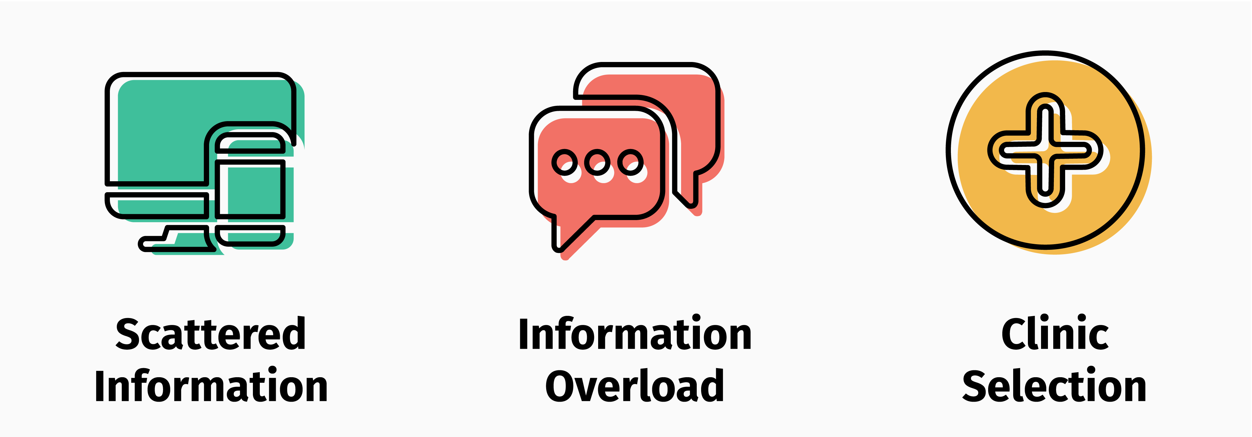
Pain Points
With a solid understanding of Issa and her struggles, we voted to identify the major pain points in her journey.
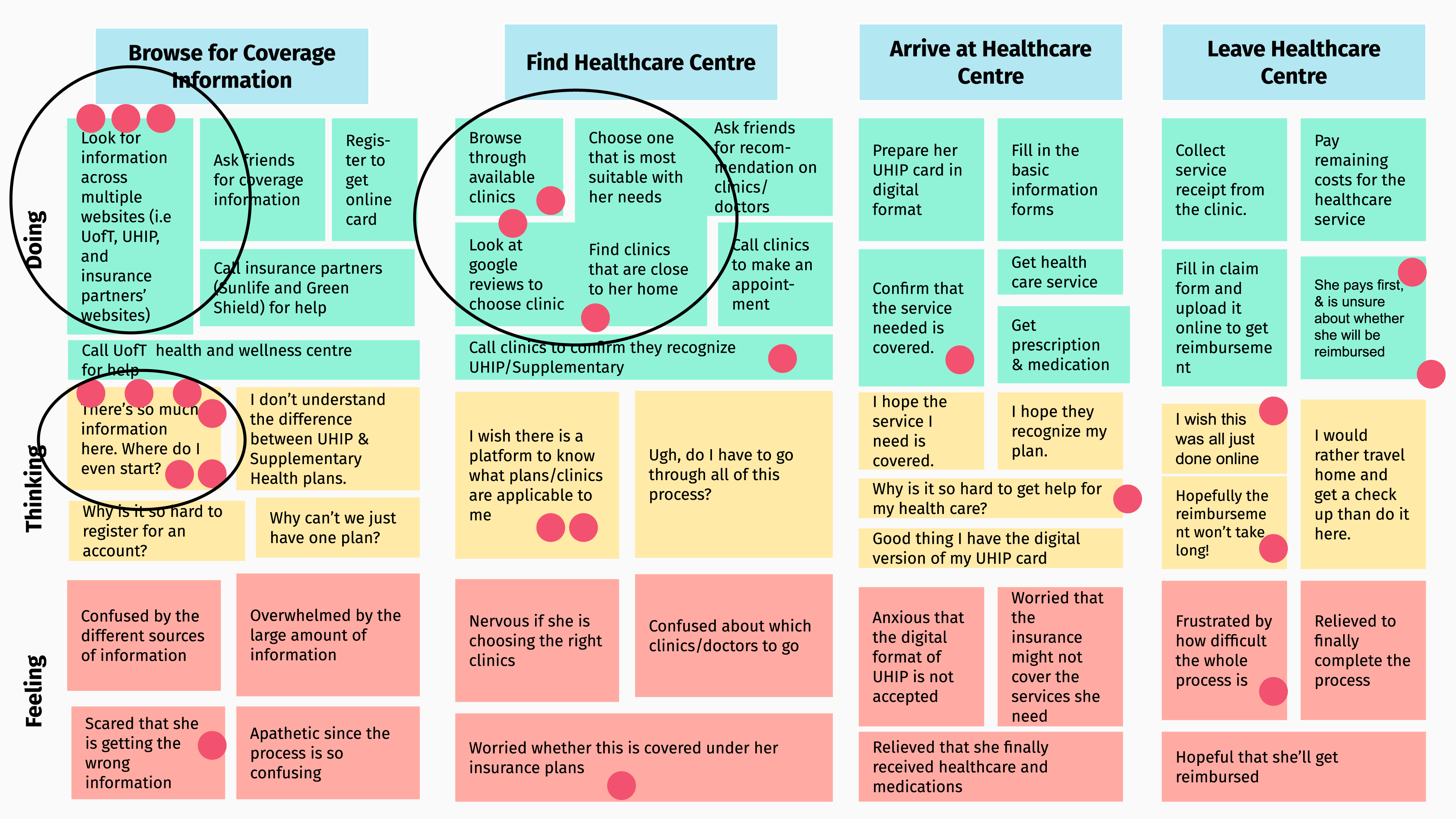
These are issues she & other international students encounter when looking for healthcare information.
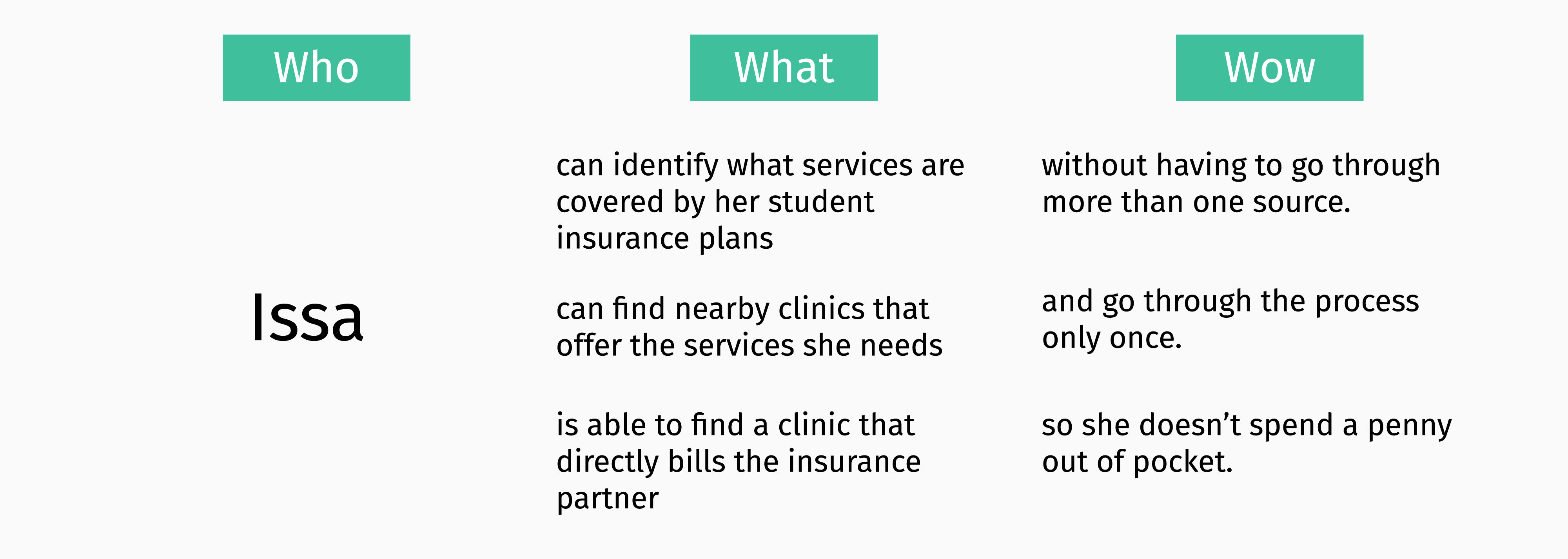
Design Goals
From these pain points, we created three goals to narrow the scope of our design.
Ideation
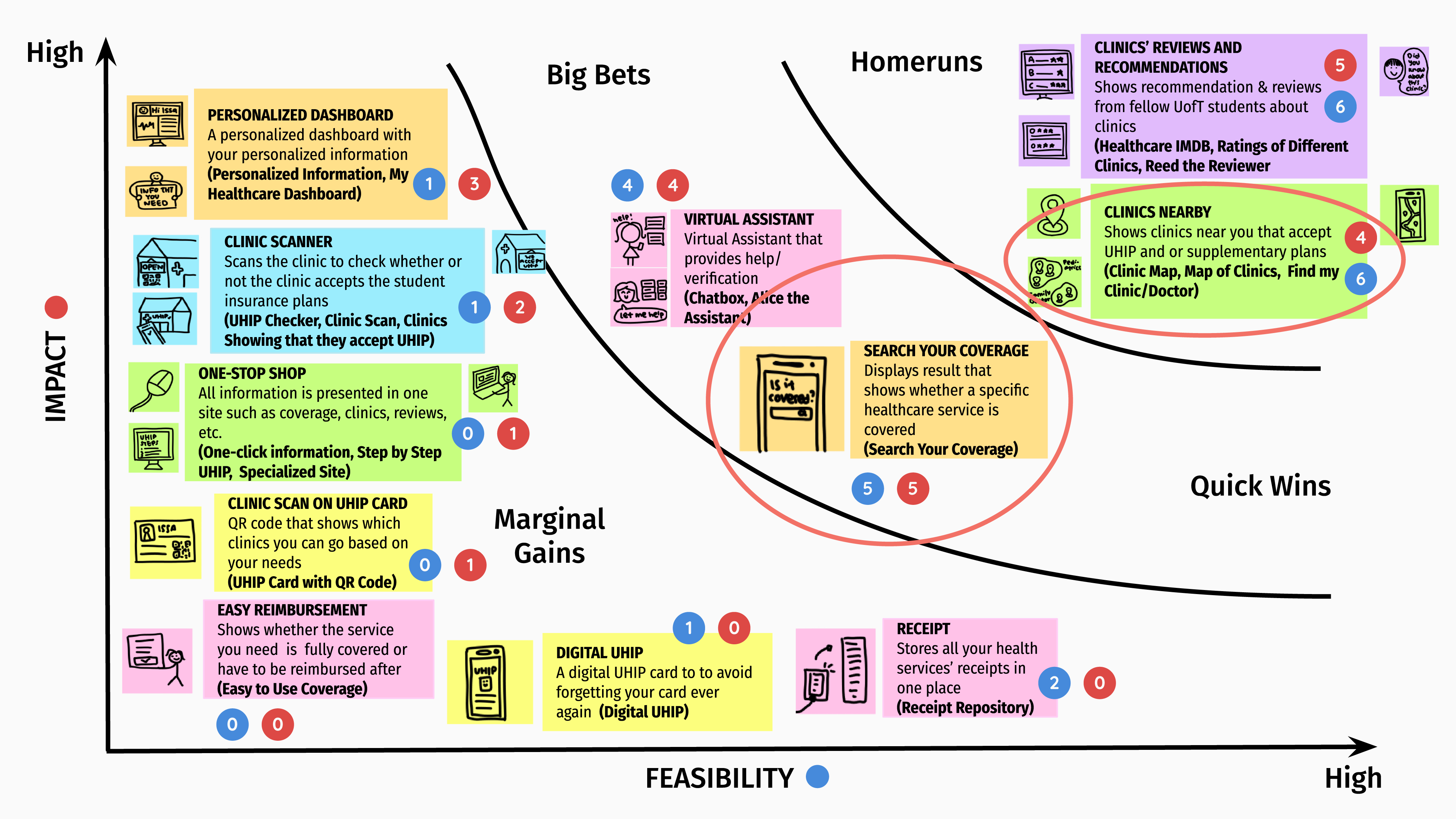
Letting our imagination run wild, we came up with several ideas to help Issa.
With the help of a grid to prioritize them in terms of impact and feasibility, we settled on ideas that aligned with our design goals. For this reason, we did not select ‘Clinics Reviews and Recommendations’ despite its high impact and feasibility.
Design, Test, Iterate
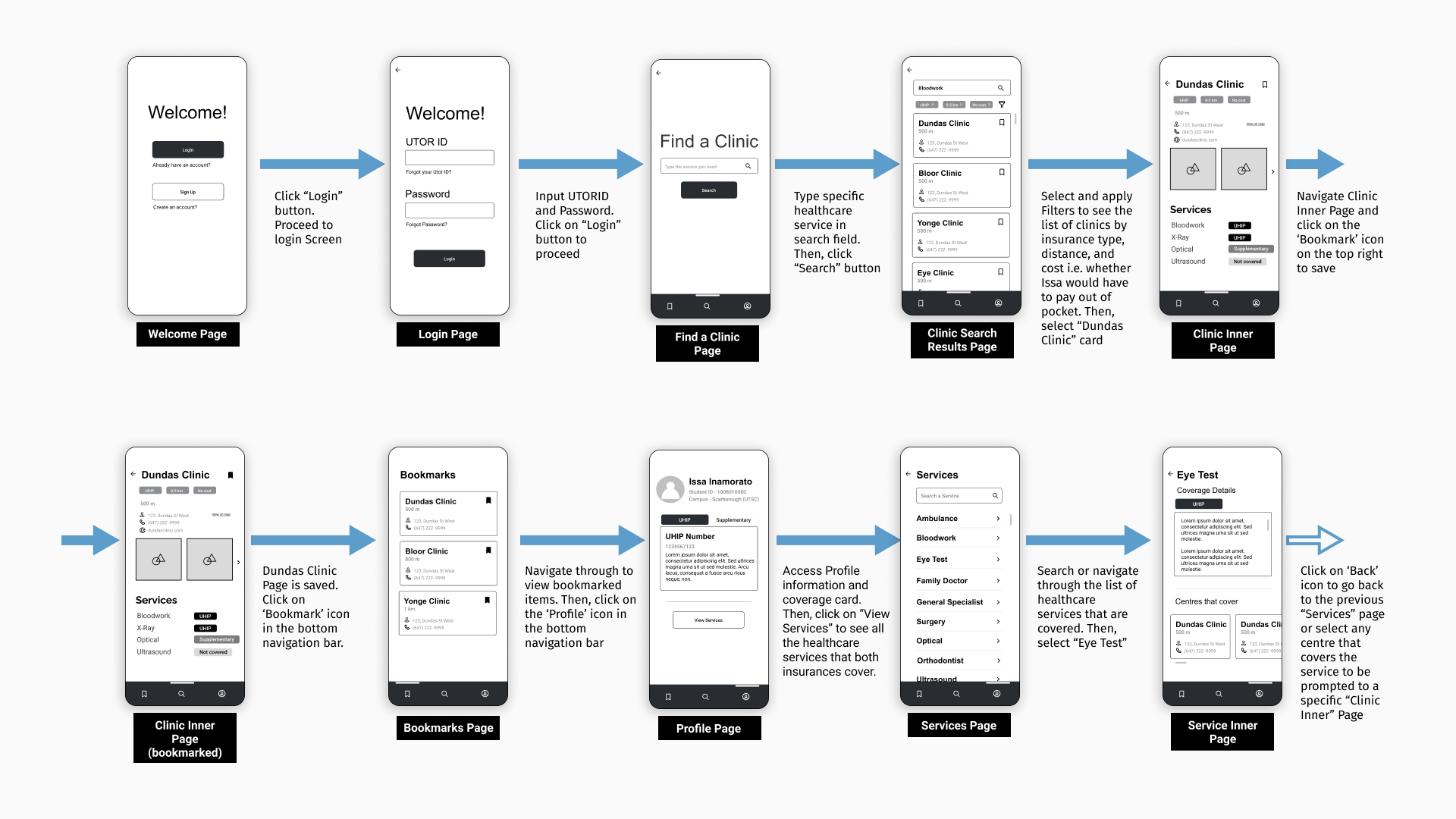
From there, we started ideating on a low-fidelity prototype for UHealth+. We chose to develop UHealth+ on mobile so that students like Issa could access our solution anytime and anywhere. We focused on three main task flows.
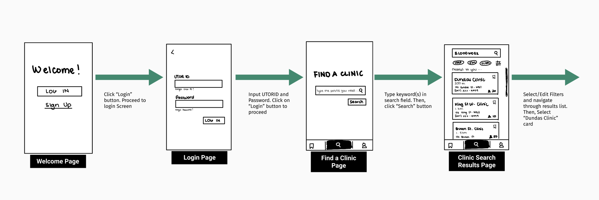
1. Login, Search and Filter
- Integrated University login to build student trust in UHealth+ and eliminate the registration process.
- Designed Search and filter functions to find a nearby clinic that fits student-specific needs and bills insurance partners.
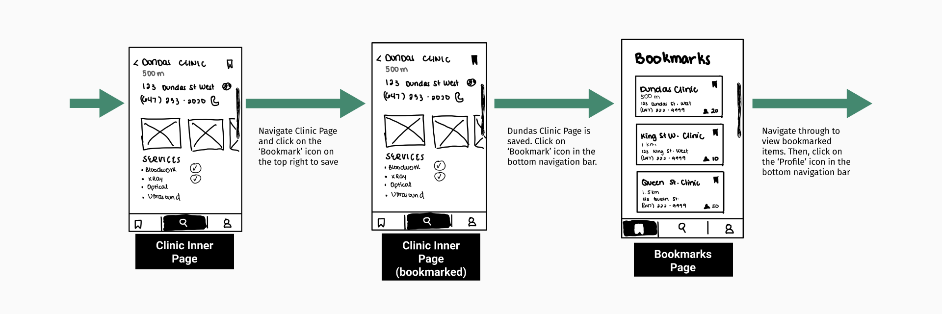
2. View and Bookmark a Clinic
- Enabled students to create a list of previously viewed and preferred clinics.
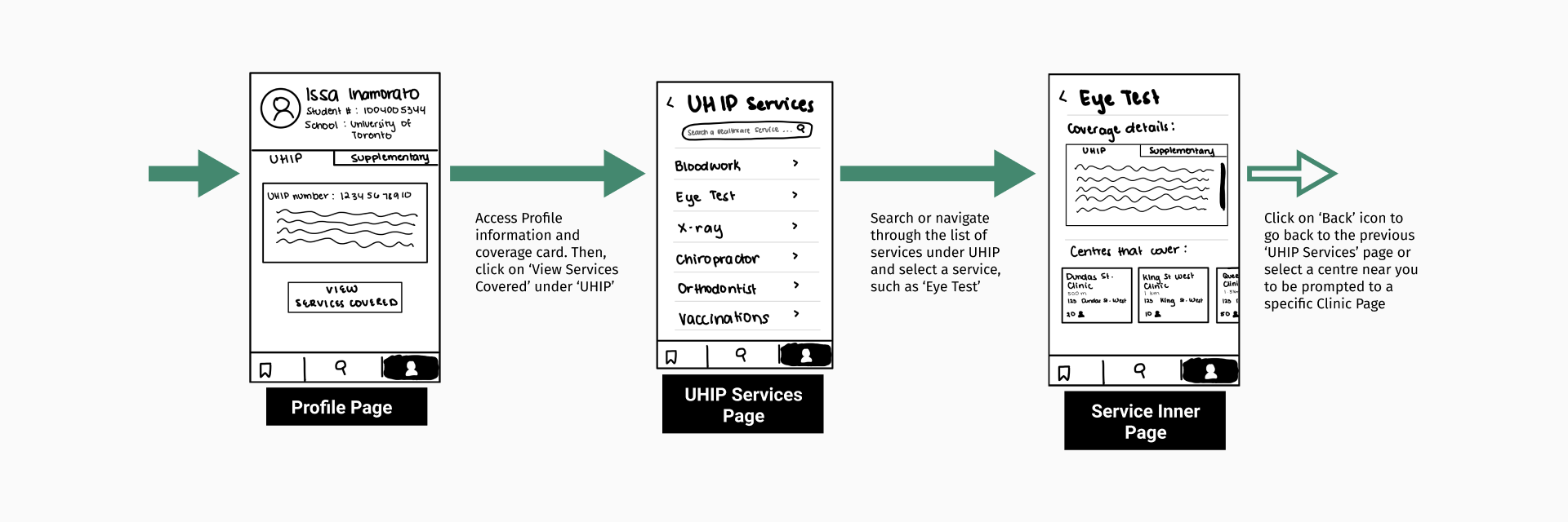
3. Access Coverage Card and Service Details
- Designed a profile screen that displays insurance card details and services covered.
- Added a section that recommends clinics based on the services needed.
We then conducted a lean evaluation of this prototype with 3 participants to detect potential issues. Since users found a few icons ambiguous and some information both redundant and unnecessary, we fixed these problems while shifting our designs from pen and paper to Figma. We created a medium-fidelity wireframe set before moving on to usability testing.
Usability Testing
To assess the usability of our prototype, we ran scenario based tests with five representative users. We asked each participant to apply the think-aloud protocol and complete the following tasks:
- Log in and Find a Clinic for a General Check-Up
- Apply Filters to the Search Results
- Bookmark a Clinic
- Find Profile Information
We conducted post-task surveys and post-test interviews to capture their attitude and behaviour regarding the application. We discovered that participants liked the overall flow, information organization and easy access to personal healthcare information. They also found the search, filter and bookmark functions intuitive. However, there were also a few issues, which we intend to fix.
1. Confusing Filter Labels
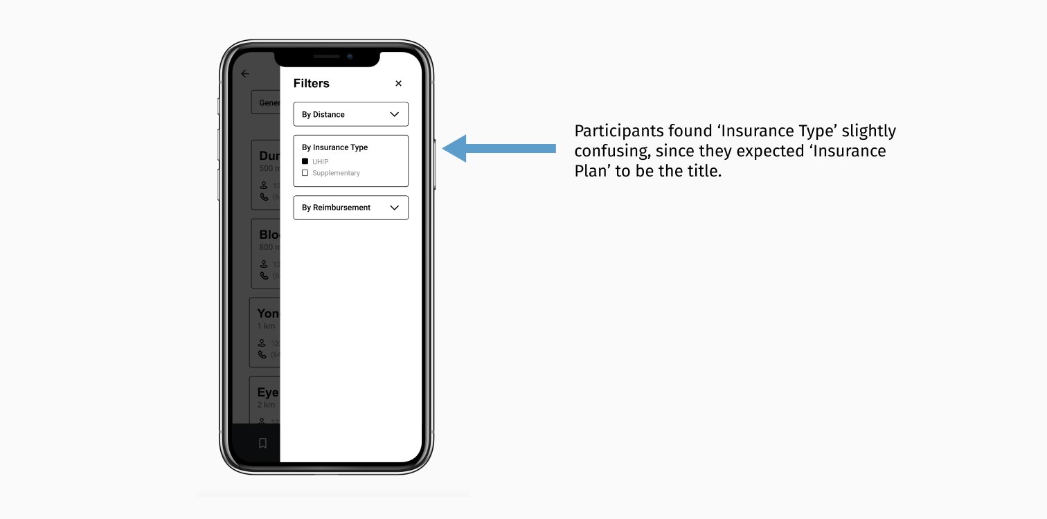
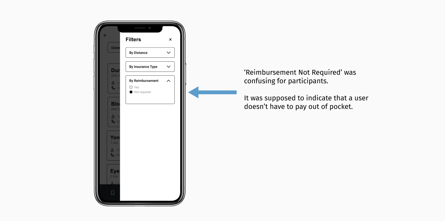
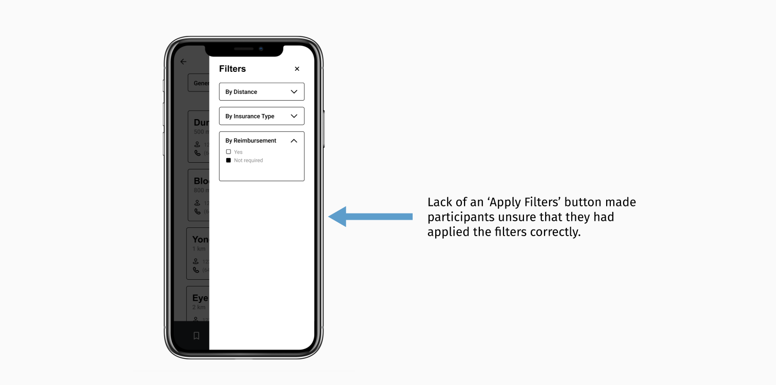
2. Missing Filter CTA
3. Confusing Icons
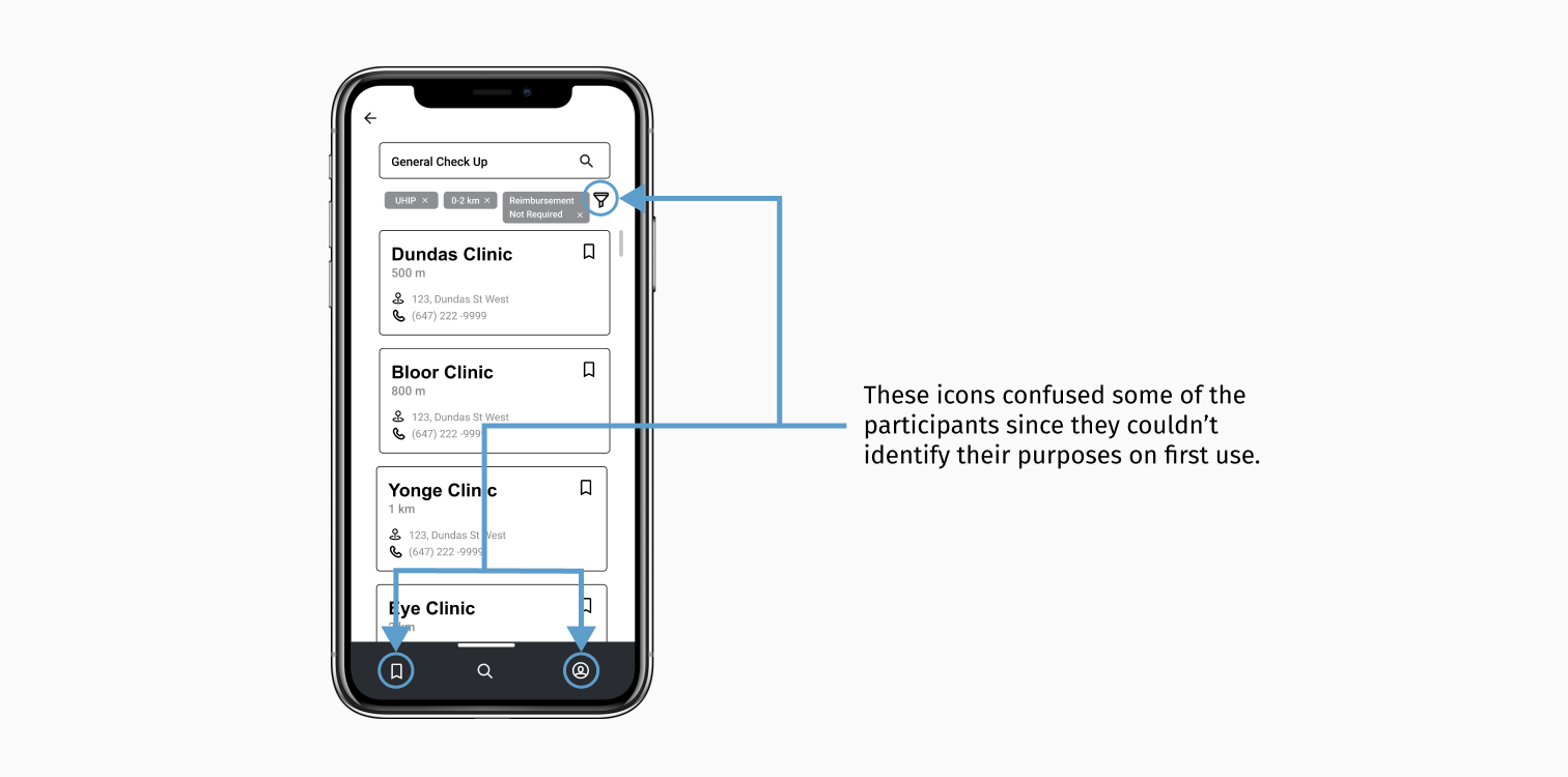
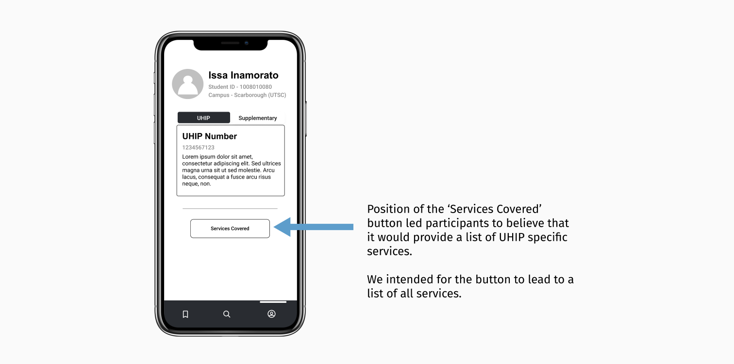
4. Unclear Scope of the ‘Services Covered’ Button
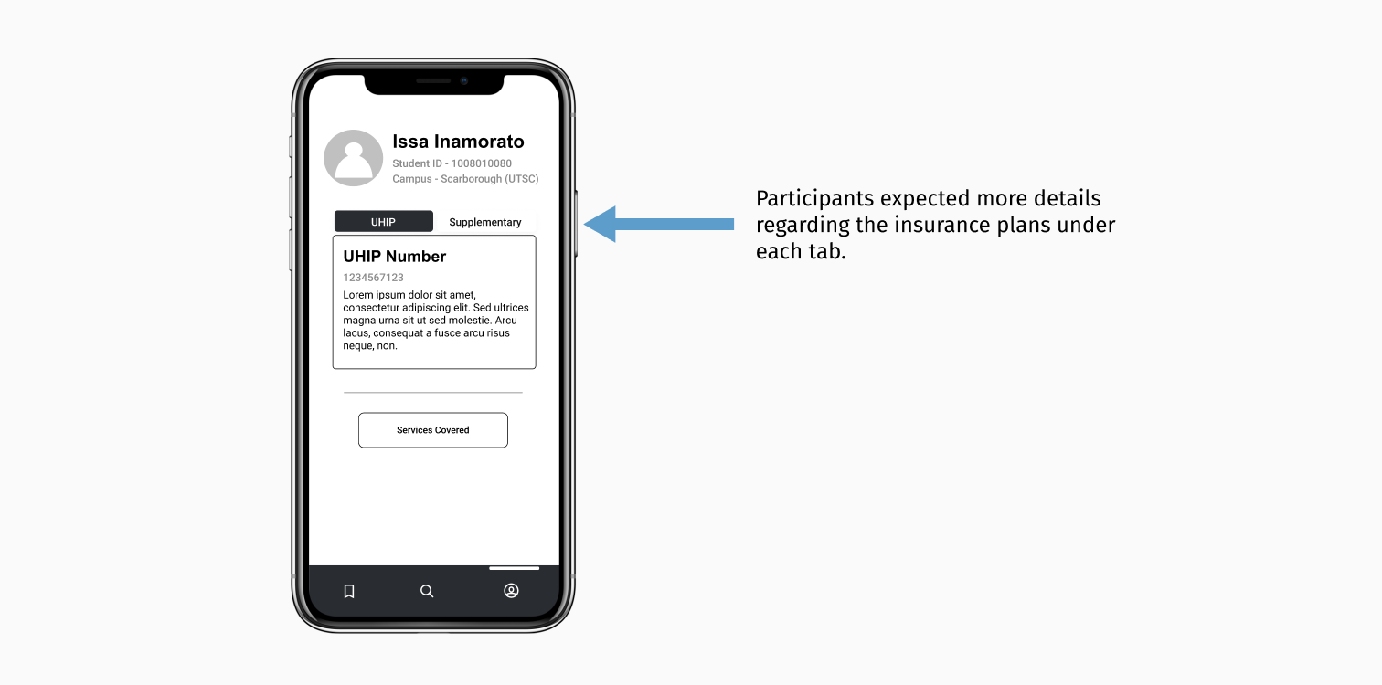
5. Lack of Information Regarding the Plans
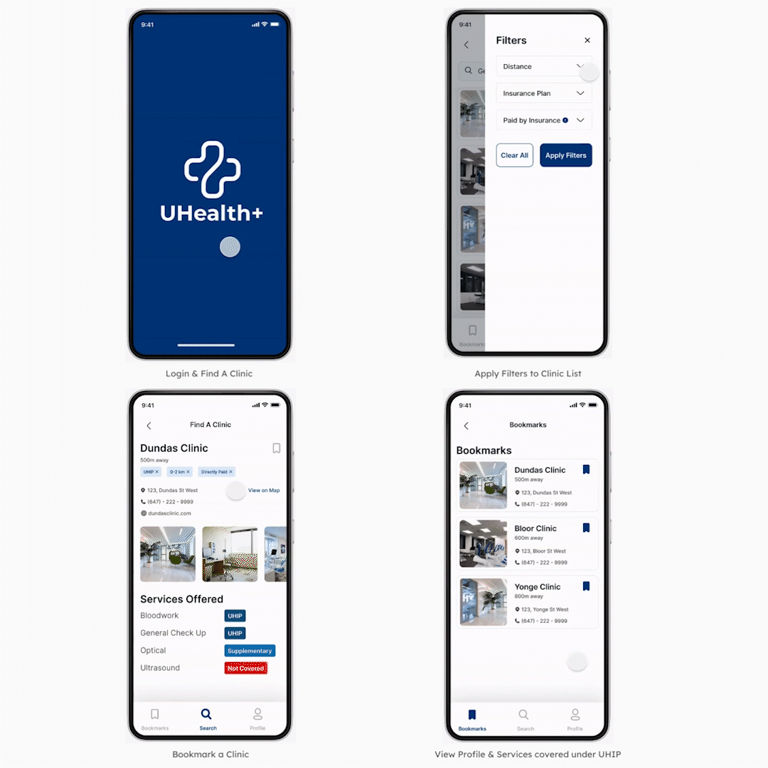
Prototype
Armed with the insights from the usability testing, we used Figma to create a high-fidelity clickable prototype that contained supporting text with icons, clear filter labels with information indicators, and appropriate call-to-actions.
Future Steps
Given more time, we would have developed this project further by following these steps.
1. Fix Remaining Issues found during Usability Testing
- Include a walkthrough for first-time users.
- Add relevant information or resources to understand both insurance plans.
2. Create 2 Additional Personas
- Expand the project scope by considering more user groups.
3. Explore More Big Ideas and Participant Suggestions
We would explore features derived from our big ideas and participant suggestions such as:
- Allowing the users to search by symptoms and synonyms of diseases to address potential language barriers.
- Introducing a virtual assistant.
- Testing a feature to rate and review clinics.
4. Partner with the Innovation Hub
- Conduct additional research on user needs and similar platforms such as League.
- Reach out to different stakeholders to get their support and opinions.
- Evaluate impact and feasibility of ideas with multiple stakeholders, including user representatives.
Learnings
1. Optimism must be tempered with realism.
When my team and I originally started working on this project, we were incredibly idealistic. However, our research kept us grounded. We realized that it was impossible to create a solution to “quicker-fixer-up” all issues, even if we had more time. Given the tight deadlines and limited resources, we decided to make a solution that would solve major pain points instead. I believe the outcome was more realistic but still impactful.
2. Low-Fidelity Prototyping is crucial to the design process.
As a person with a technical and graphic design background, I have always preferred working directly on computer software. It was during this project that I realized the importance of lo-fi prototyping. It allowed us to spot issues & fix them with little effort. Given that the process was quicker, easier & less expensive, I will utilize it for future projects.
3. Good Teamwork is essential in any project.
I am grateful for having worked in such a great team. Even though everyone in my group came from different backgrounds with varying levels of design knowledge, we found unity in a common goal and work ethic. We learned a lot throughout this journey, from the process and each other. Our differences in perspective helped us shape a realistic solution that remained true to our original vision.